Reference Room Sign
Ms. Chakrabarti wants a new sign for the reference room!
Requirements:
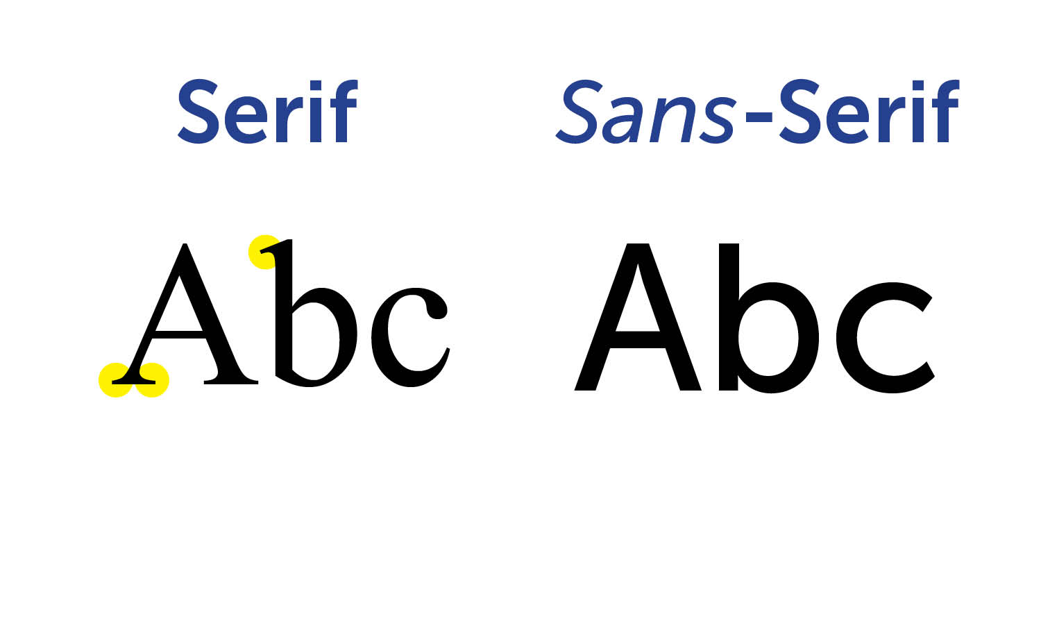
• High Contrast: no brown text on black, for example. Use dark-colored text on a light background or vice-versa.• Sans Serif:
Use a sans-serif font. Sans-serif
text is easier to read on a sign. Use fonts that don't have thin
lines.• Upper-and-Lower Case: Use upper-and lower case instead of ALL UPPER CASE when possible to make it easier to read from a distance.• Size:
36" wide and 24" high, which (at 72 pixels per inch) is 2592 pixels x 1728 pixels. • Font Size: As big as possible without making the sign seem crowded.• Border:
Make a border around the edge of your sign. Borders
have been shown to increase the reading speed of signs by 26%.• Graphics:
You are encouraged to be creative and use graphics. Use
graphics in a way that will not make the sign harder to read.
Obvious choices would be something to do with books or Logan.
You can do something like those holiday Google
logos or something different.
Give credit for any images that you use in your sign--put the URL in tiny letters on the bottom.